Colour in Print: 5 Tips for stunning print materials.
The correct use of colour in print materials can significantly enhance the impact and appeal of documents.
However, achieving high-quality colour prints requires attention to detail and adherence to best practices.
Here’s my top 5 tips to ensure your colour printing is as effective and stunning as possible:
1 | Understanding Colour Modes
You may have read about CMYK and RGB somewhere if you’ve ever dabbled in some form of printing. These are known as colour modes, and they are each used for a very specific media.
RGB also known as red, green, blue is the colour mode used on screens. So any colour you see digitally or on screen, is generated through the combination of the three colours red, green and blue.
So naturally CMYK would be the opposite - the colours used for print.
**Always ensure that your files are converted to CMYK and not in RGB to avoid any misprint of colours.
It can become very costly and time consuming.
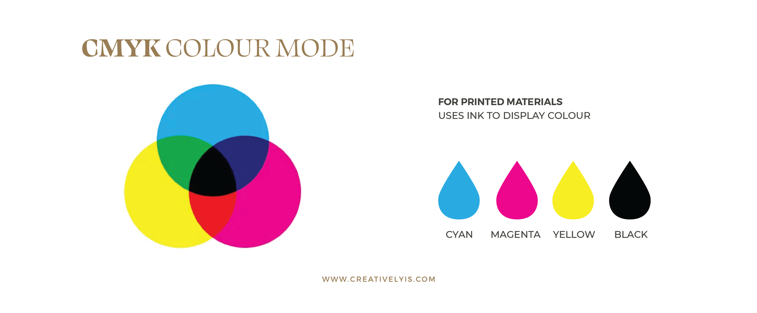
The acronym CMYK stands for the four colours of toner or ink most commonly used in the printing process - Cyan, Magenta, Yellow and Key (Black). CMYK is necessary in any print materials to ensure colour accuracy and vibrancy.
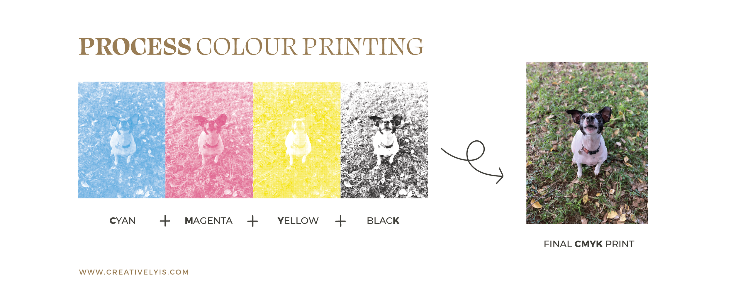
These colours are measured in percentage values for example: “spring green” would be C: 50% M: 0% Y: 100% K: 0%. This colour model is known as a subtractive colour model, and mostly used in laser printers known as process colour printing. This means that colours are added to a white background to remove other colours from the visual field. So a printer would print the basis colour cyan on any imagery that has a percentage of it first, then the layer of magenta, then yellow and lastly black. A good example to see this is in newspapers - if you look closely you will ever so subtly see the different layers of colours printed in the form of small overlapping dots.
An important note on using black:
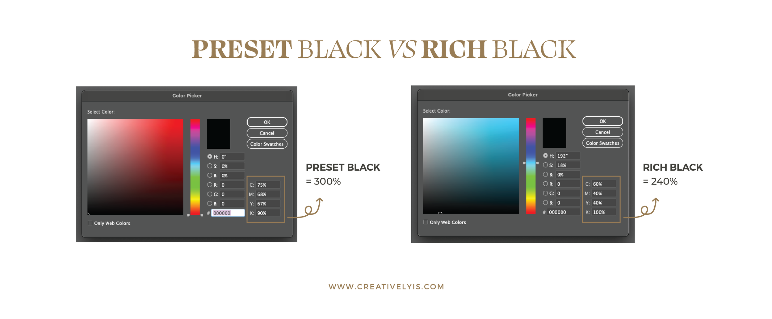
When designing for print using CMYK colour mode, we never use the basic black that most design programs have as presets. This black might look like 100% black on a screen but when printed it’s more grey. This is due to the way the CMYK printing process works.
A general rule is to check if the total CMYK value of the selected black colour is more than 280%. The example below shows the “basic preset” black in Adobe Illustrator - the total of all four values are 300%. So to solve this I generally use the percentage values on the right - C: 60% M: 40% Y: 40% K: 100% , known as “rich black”.
2 | Printer Specifications and Calibrations
Ever wondered why the colours you view on your screen almost never look the same once printed even when viewing it as CMYK? This is due to your monitor or computer's colour calibration. To fix this you simply need to make sure that your device is set for accurate colour reproduction. You can ask your local printer to help you do this, alternatively there are many tutorials and software available online.
It is also important to check with your chosen print shop on their print specifications. Most designers have designated printers they use for their clients’ print material - as do I. This way we know that the colours our clients see on design proofs, print out exactly as desired. It all depends on the quality and type of printer the print shop uses.
It is also important to note the chosen medium your designs will be printed on, as this can significantly influence how vibrant a colour shows once printed.
3 | Choose the right paper or print medium
Ah the world of paper mediums! I have always loved the way paper smells and how each one has a unique texture. That is why it is very important to ensure you choose the right paper medium for your desired project. There are a multitude of options these days. The best way to help you choose is to purchase a printed swatch sample from your chosen print shop. With this you can see the way each type of paper showcases the printed ink colours, and how the texture looks and feels. I definitely recommend this to avoid colour and texture disappointment.
4 | Testing and Proofing
Testing and proofing printed material is very important. Work closely with your printer to ensure colours match your expectations and adjust settings if necessary. It is best to alway print a test copy to check colours, clarity, and overall appearance before proceeding with large-scale printing. This way you can review proofs carefully to catch any colour discrepancies or design flaws before finalising your print materials.
5 | Brand Consistency
The last, and most important tip is brand consistency. Always make sure that your designs are in your brand colours, that you’ve used your brand fonts, and that you have followed your brand guidelines with regards to image and logo use as well as sizing and spacing. Keeping to these guidelines will ensure brand consistency and loyalty.
By following these tips, you can consistently produce stunning print materials that enhance your projects. Whether for business or personal use, investing in a proper print shop and equipment ensures your colour printing meets the highest standards of quality and professionalism. And if you get stuck, you can always get a professional designer’s input.
To help you keep on track, I’ve created a FREE Colour Ready Print Checklist to keep on-hand for your next project. Simply sign up below to grab it.


