Creating a Colour Palette: Tips for the perfect brand colours.
Colour is a powerful tool, capable of evoking emotions, setting moods, and capturing attention. Dynamic colour palettes can transform ordinary designs into visually stunning masterpieces that leave a lasting impression on your audience. In this blog post, we'll explore some tips for creating captivating colour palettes that breathe life into your branding and make you stand out from the crowd.
By understanding your brand on a deeper level, you can then select colours that authentically reflect its personality and message.
What to consider when selecting your brand colours
A well-chosen colour palette can elevate your brand identity, captivate your audience, and set you apart from the competition. But how do you go about creating an eye-catching colour palette that truly resonates with your audience? Here are six tips to guide you on your branding colour journey:
01. Define your brand identity
Before you settle on a colour palette for your brand, the most important thing to do is define your brand’s identity. This will help you fully understand your brand’s values, personality, target audience and brand message. Then you will be able to answer the question; What emotions do you want to evoke? By understanding your brand on a deeper level, you can then select colours that authentically reflect its personality and message.
02. Consider Colour Psychology
Colours have the remarkable ability to evoke specific emotions and associations. Delve into the fascinating world of colour psychology to understand the meanings behind different colours. For example, blue conveys trust and reliability, while yellow exudes warmth and optimism. By strategically incorporating these psychological cues into your colour palette, you can create a deeper connection with your audience and convey your ideal brand personality and message.
Related post: The Psychology Of Colour
03. Embrace Colour Theory
Colour theory provides a framework for understanding how colours interact and influence each other. By applying principles such as hue, saturation, and value, you can fine-tune your colour palette to achieve the desired visual impact. Experiment with different shades, tints, and tones to add depth and dimension. Remember that subtle variations in colour can make a significant difference in the overall aesthetic of your palette.
When designing your colour palette, strike a balance between contrast and harmony. Contrast is essential for creating visual interest and ensuring readability, while harmony ensures a cohesive and unified look. Pair light and dark shades or complementary colours to make important elements stand out. High contrast between text and background colours improves readability and ensures that your message is easily understood. However, be careful not to create too much contrast, as it can be overwhelming.
Related post: Colour Theory Essentials
04. Limit your palette
While it's tempting to use a wide range of colours, sticking to a limited palette can create a more cohesive and memorable brand. Aim for around 1-3 main colours and a couple of accent colours that complement each other. This simplifies decision-making and maintains consistency across your branding materials.
05. Draw inspiration from diverse sources
Inspiration can be found everywhere. Nature provides an abundance of harmonious colour combinations, while art and design trends can offer fresh ideas. Take a walk outside and observe the vibrant hues of flowers, foliage, and landscapes. By immersing yourself in the beauty of the world around you, you can discover unique colour combinations.
Look for inspiration in landscapes, artwork, fashion, and even social media platforms like Pinterest or Instagram. Pay attention to colour schemes used by successful brands in your industry, but don’t hesitate to think a little outside the box.
Look for colour schemes that resonate with your brand's aesthetic and ethos, and don't hesitate to put your own unique spin on them.
Feeling a little overwhelmed about starting from blank? Grab my free colour palettes below for some inspiration to start from!
06. Be exact and consistent
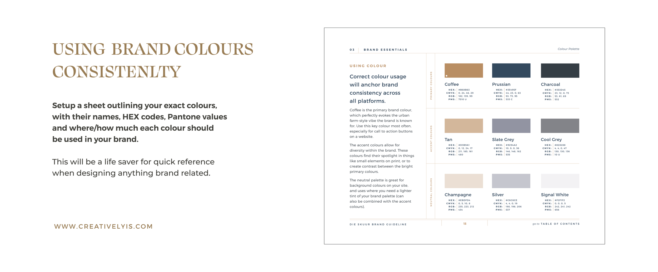
It’s easy to just grab a few colours from a few sources and call it a day. But being exact in the colours you choose will help you be consistent when applying these to your branded material. Setup a sheet outlining your exact colours, with their names, HEX codes, Pantone values and where/how much each colour should be used in your brand. This will be a life saver for quick reference when designing anything brand related.
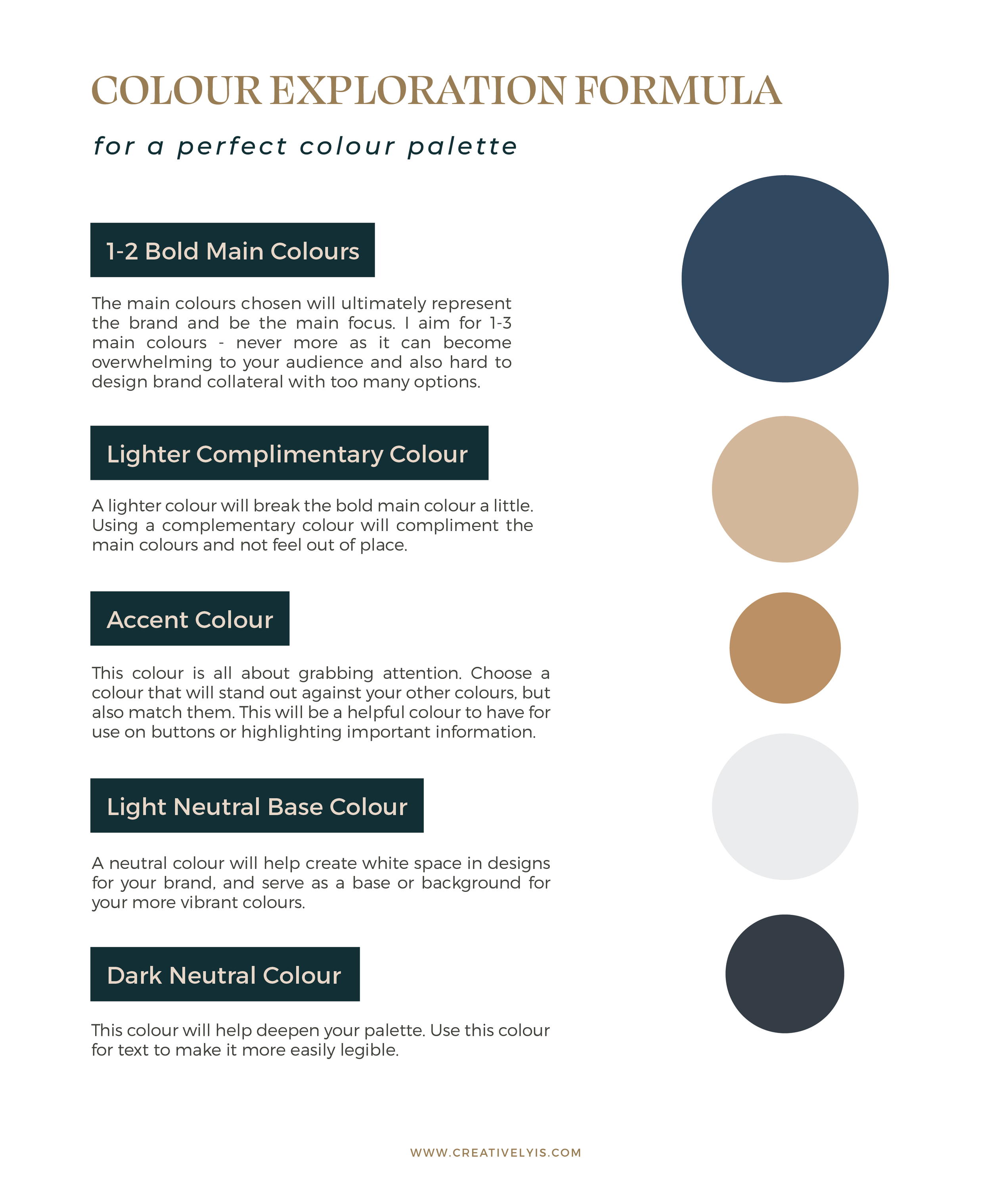
Colour Exploration Formula
When I explore colour palettes for my clients’ branding, I always keep these in mind. The most important for me is defining the brand’s identity. Once we have that established I can start to pull together colour palette ideas. I use these five things to make it a little easier to narrow down.
1-2 Bold Main Colours
The main colours chosen will ultimately represent the brand and be the main focus. I aim for 1-3 main colours - never more as it can become overwhelming to your audience and also hard to design brand collateral with too many options.
A Lighter Complimentary Colour
A lighter colour will break the bold main colour a little. Using a complementary colour will compliment the main colours and not feel out of place.An Accent Colour
This colour is all about grabbing attention. Choose a colour that will stand out against your other colours, but also match them. This will be a helpful colour to have for use on buttons or highlighting important information.A Light Neutral Base Colour
A neutral colour will help create white space in designs for your brand, and serve as a base or background for your more vibrant colours.A Dark Neutral Colour
This colour will help deepen your palette. Use this colour for text to make it more easily legible.
Put your palette to the test
So now you should have the perfect brand colour palette that you love and truly reflects your brand. You can now feel confident to apply it to all your designs and thus ensure that your branding is cohesive and stands out!
Want to learn more about colours in design? I created a Free PDF about colour theory essentials. Simply sign up below to download.


