Colour Theory Essentials: Understanding the basics of colour
Colour is one of the many things we as humans interact with on a daily basis. It influences our emotions, choices, and perceptions. In design specifically, it plays a very important role and if you understand the basics of colour theory, it changes the way you and clients feel, interact and perceive a brand. So here are the 3 core principles everyone should have a basic understanding of when it comes to colour basics and theory.
Colour Theory - what is it?
Let’s start off with what colour theory is exactly. Simply put, it is the study of how colours interact and how they can be used to create visuals that are appealing whilst evoking some kind of emotion to the viewer. Using colours in a pleasing manner by applying colour theory can convey a specific meaning, attract attention if perceived as pleasing or ugly and create an emotional response such as trusting, excited or calm. To me it is the first thing that influences me as a buyer or client when interacting with a brand, without even having to think about it.
There are 3 basis of colour theory:
The colour wheel, Colour harmony and Colour Psychology.
The Colour Wheel
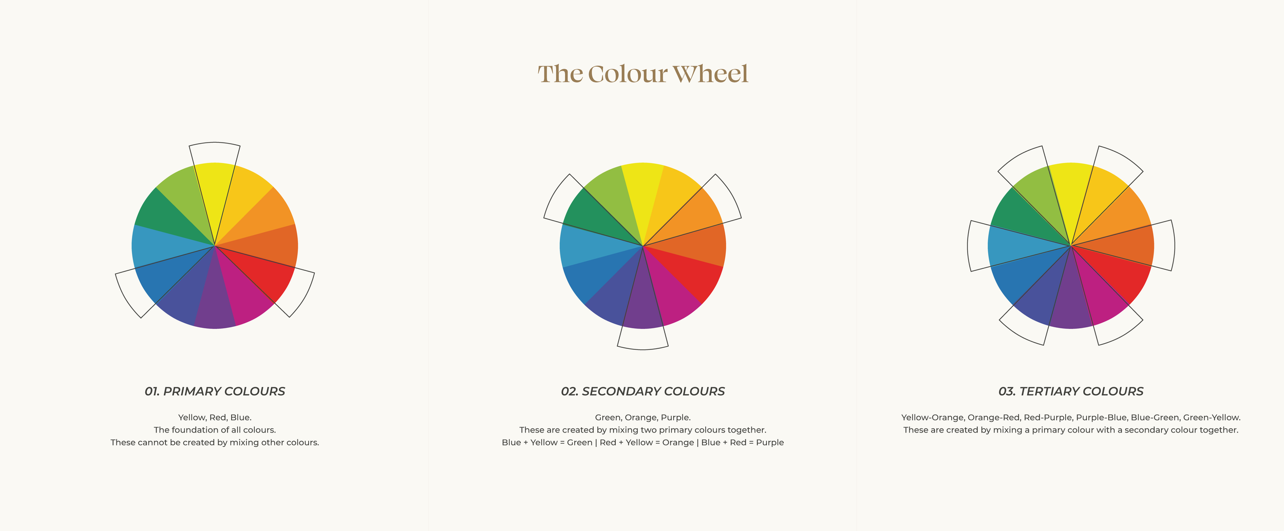
The colour wheel is a visual diagram that represents all the colours on the visible spectrum and their interaction with one another. The basis of the colour wheel can be divided into 3 parts; primary colours (red, blue, and yellow), secondary colours (green, orange, and purple), and tertiary colours (created by mixing a primary colour with a secondary colour).
01. Primary Colours
Yellow, Red, Blue.
The foundation of all colours.
These cannot be created by mixing other colours.
02. Secondary Colours
Green, Orange, Purple.
These are created by mixing two primary colours together.
Blue + Yellow = Green | Red + Yellow = Orange | Blue + Red = Purple
03. Tertiary Colours
Yellow-Orange, Orange-Red, Red-Purple, Purple-Blue, Blue-Green, Green-Yellow.
These are created by mixing a primary colour with a secondary colour together.
Colour Harmony
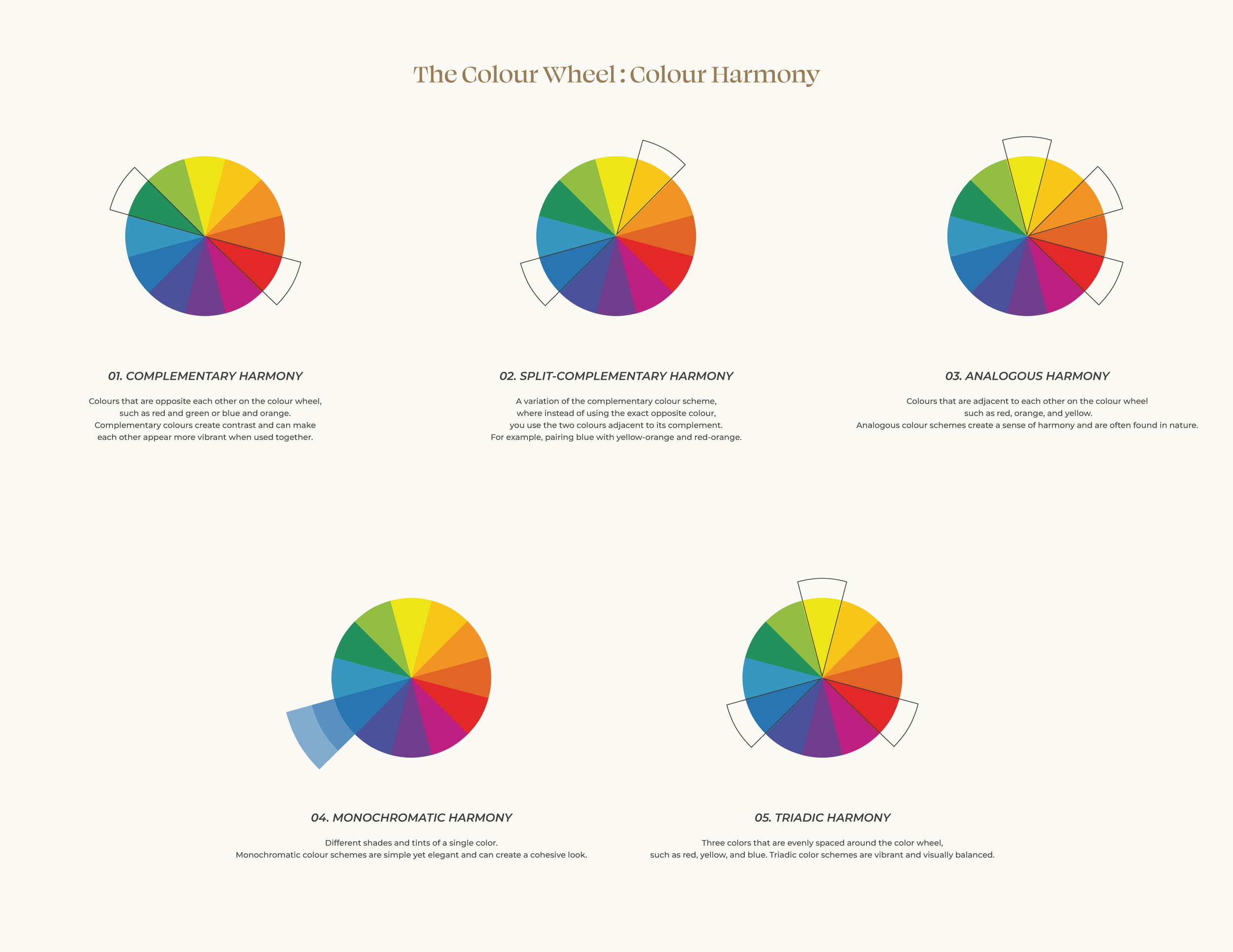
Colour harmony refers to the pleasing arrangement of colours in a design. There are five main colour schemes that designers use to achieve harmony: Complementary, Split-Complementary, Analogous, Monochromatic, Triadic.
Colour Psychology
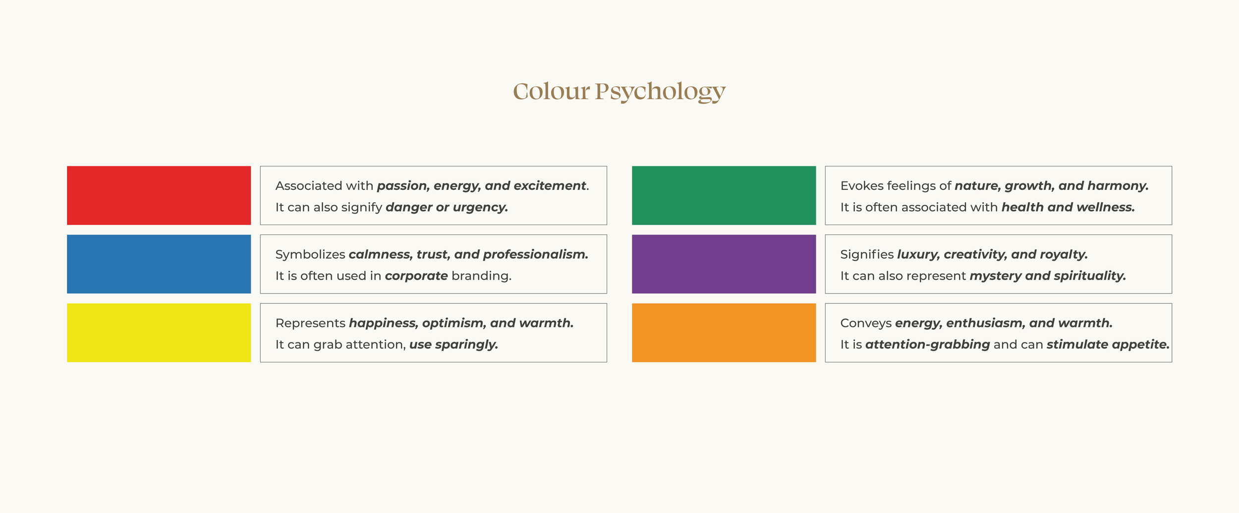
Colours have the power to evoke emotions and convey messages. Understanding the psychological effects of colour can help designers communicate effectively with their audience. Here are a few examples of the emotions and messages some colours can convey:
Colour theory is a vast and fascinating subject that plays a crucial role in all forms of design. By understanding the basics of colour theory, including the colour wheel, colour harmony, and colour psychology, beginners can lay a solid foundation for their creative endeavours. Experimenting with different colour combinations and observing their effects can help you develop your design skills and create visually stunning compositions. So go ahead, unleash your creativity, and let colour be your guide!
Want a handy guide to keep for reference? I created a Free PDF version. Simply sign up below to download.


