The Psychology Of Colour: How it affects your brand.
In the design world, colour is so much more than simply a visual element; it’s one of a designer's most powerful tools that can evoke emotions, shape brand perceptions, and influence audience behaviour. Understanding the psychology of colours allows designers to harness the full potential of colour in design, thus effectively communicating brand messages and eliciting specific responses from a brands audience.
Let’s dive into the world of colour psychology, why it’s important and explore how the use of specific colours can influence your brands perception through emotions and responses.
Why is colour important in branding?
Emotional Connection
One of the primary goals of colour in branding is to establish an emotional connection with the desired audience. Colours have the power to evoke specific emotions and trigger personal associations. By choosing colours for a brand that resonate with the desired target demographic and reflect the desired brands personality, we can create a visual experience that resonates deeply with a specific audience while forging lasting connections and simultaneously fostering brand loyalty.
Visual Hierarchy
Colour is used to create visual hierarchy within designs, guiding a viewer's attention and prioritising information. Using colour harmony as a basis helps us create this. By combining a bright colour with more muted neutral tones of a brands colour palette, they tend to stand out more prominently and so draw attention to key elements such as headlines, call to actions, and important information. By strategically incorporating colour contrast and tones, we can effectively guide a viewer’s eye through a composition, ensuring the most critical messages are communicated clearly and concisely.
Cultural Considerations
It's essential to recognise that the psychological effects of colour can vary significantly across different cultures and contexts. What may evoke positive associations in one culture could have entirely different connotations in another. Therefore, we have to take cultural considerations into account when selecting colour palettes, especially for global audiences. Conducting thorough research into the cultural meanings and symbolism of various colours can help ensure that designs/brands resonate appropriately with diverse audiences and avoid unintentional misunderstandings or offence.
Choosing brand colours
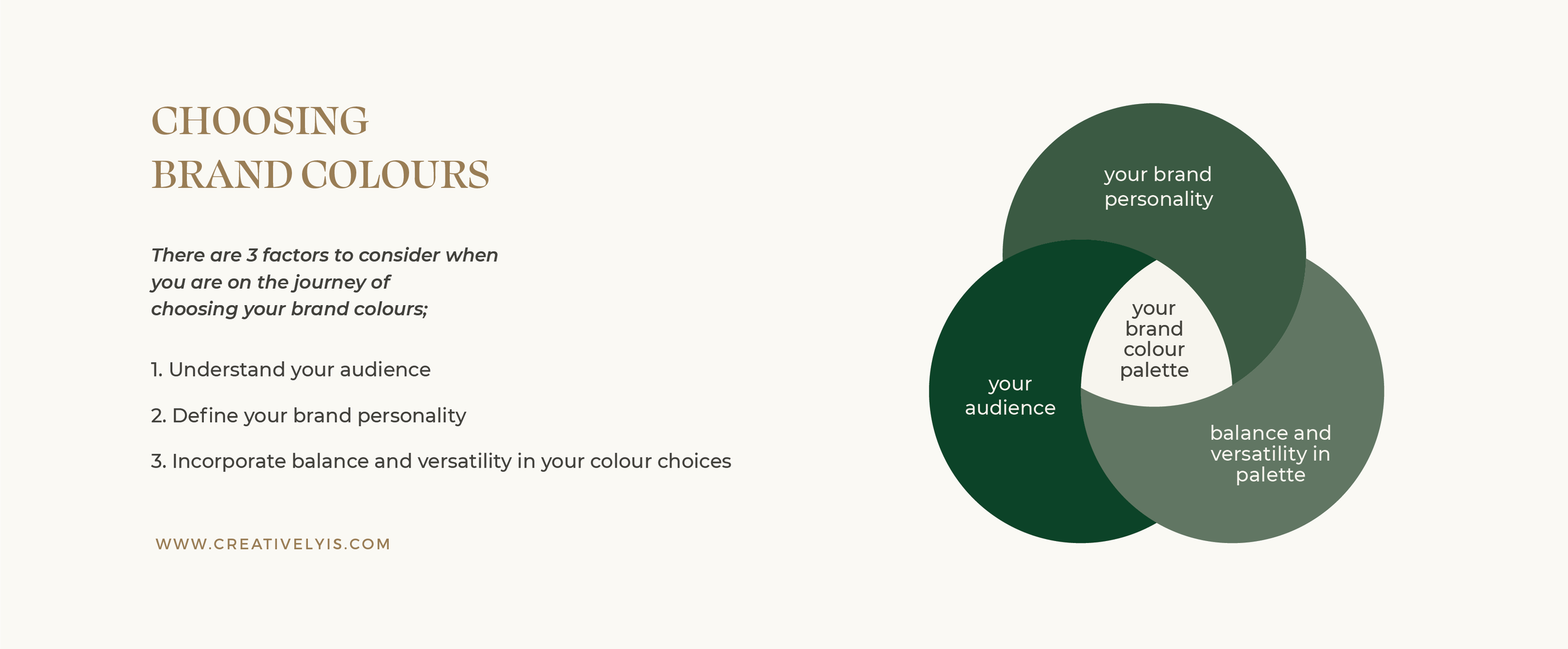
There are 3 factors to consider when you are on the journey of choosing your brand colours;
Understand your audience
Your brand audience or demographic will have a specific preference and specific colours that create emotional responses - research this extensively and consider their unique preferences.
Define your brand personality
Will your brand be bold and energetic, or would you like your brand to convey a sense of calm and tranquillity? By defining your brand's personality, you can find colours that will have the desired psychological effect to incorporate in your brand's colour palette.
Incorporate balance and versatility
A well balanced colour palette with various tones and neutral colours can be very beneficial. Choose colours that complement each other, convey your brand personality and evoke your preferred psychological response. It is best to not use more than 4 different colours. In doing so you will be able to easily create contrast, emphasise important information and create hierarchy across your brands designs.
The language of colour
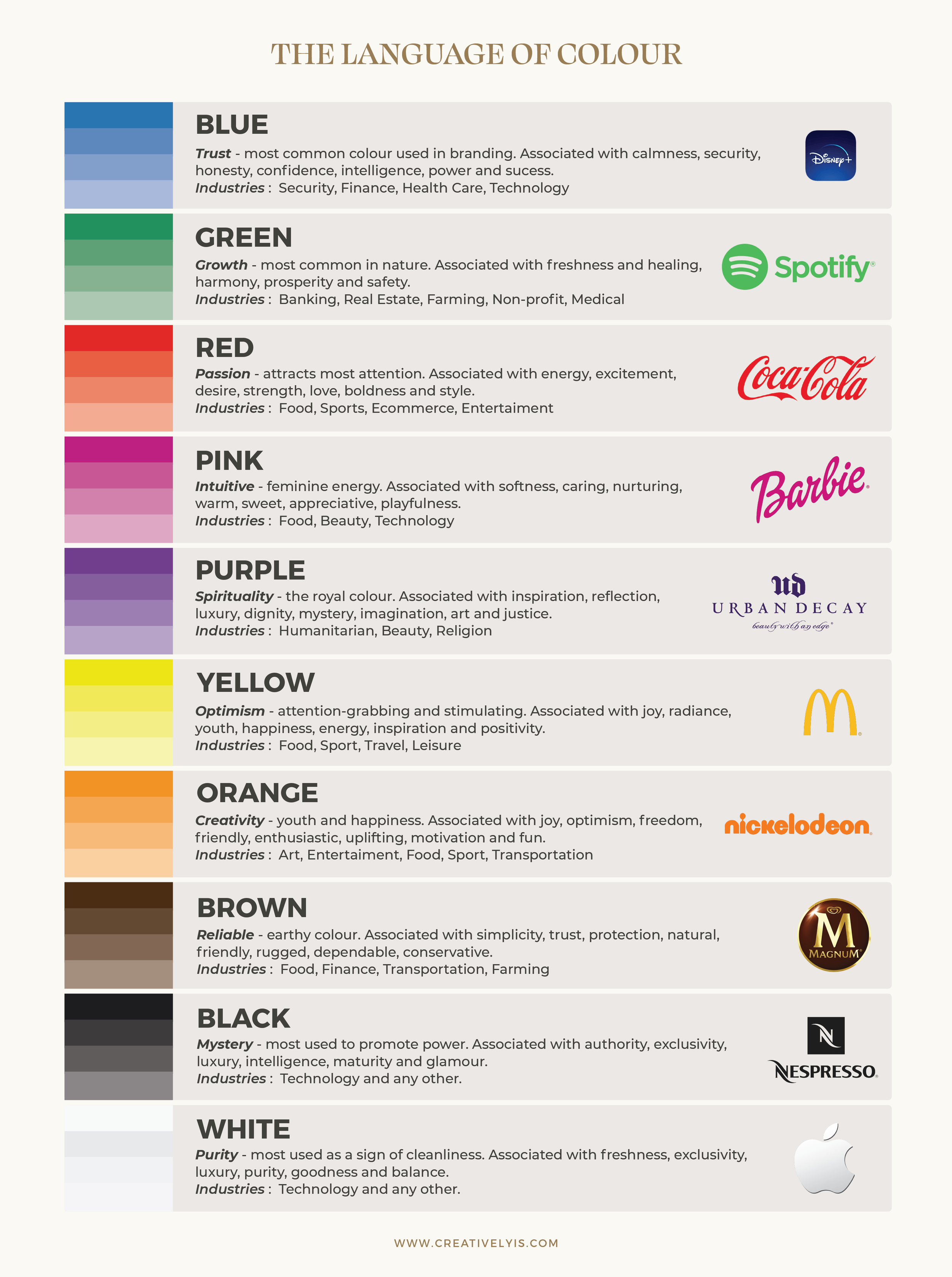
Colours possess a language of their own, speaking to us on a subconscious level and eliciting emotional responses. Different hues evoke different feelings and associations, making them a crucial aspect of visual communication. For example, warm colours like red, orange, and yellow are often associated with energy, passion, and optimism, while cool tones like blue and green convey calmness, serenity, and stability. By understanding the psychological effects of each colour, we can strategically select hues that align with the intended message and desired mood for a brand.
While perceptions of colour can be subjective, colour can have the power to ignite feelings and communicate messages about a brand. In order to achieve this, we need to understand the emotions each colour can be associated with, and then decide which of these colours align best with your brand’s message.
Colour psychology is a powerful tool for anyone, offering endless possibilities for creating visually compelling and emotionally resonant designs.
By understanding the psychological effects of colour and strategically leveraging hues to evoke specific emotions and responses, we can craft experiences that captivate, inspire, and engage audiences on a profound level.
Whether aiming to evoke feelings of excitement, trust, or tranquillity, the strategic use of colour allows us to communicate messages with clarity, impact, and lasting resonance and so plays a vital role in the conceptualisation of a brand.
Want to learn more about colours in design? I created a Free PDF about colour theory essentials. Simply sign up below to download.


